Case study
Revamping Home screen Experience for a Digital Bank
Carbon is the foremost credit-led digital bank in Nigeria and is a product that empowers over 4 million customers with access to credit, simple payments solutions, high-yield investment opportunities and easy-to-use tools for personal financial management.

Role
Product design
User research
Duration
Feb 2023, 4 weeks
Industry
Fintech, B2C
The team
1 × product manager
3 × product designers
6 × engineers
1 × product marketer
1 × QA engineer
Challenge
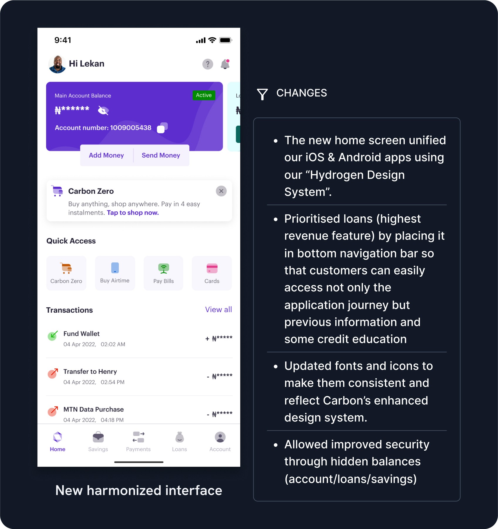
The app's homescreen presented a significant challenge with its cluttered interface, impeding user navigation and the use of the core essential feature—the loan product. Notably, data analysis identified the loan product as the most critical customer need, essentially representing the company's foundation.
Additionally, a considerable disparity in user experience persisted between the Android and iOS versions of the app, effectively treating them as separate applications. This inconsistency forced users to grapple with a learning curve when transitioning between different mobile devices.
Solution & Impact
The redesigned homescreen presents a harmonized, design-system-enhanced, clutter-free interface, greatly improving user navigation and the accessibility of essential features. To get a closer look at these changes, you can watch the feature launch video.
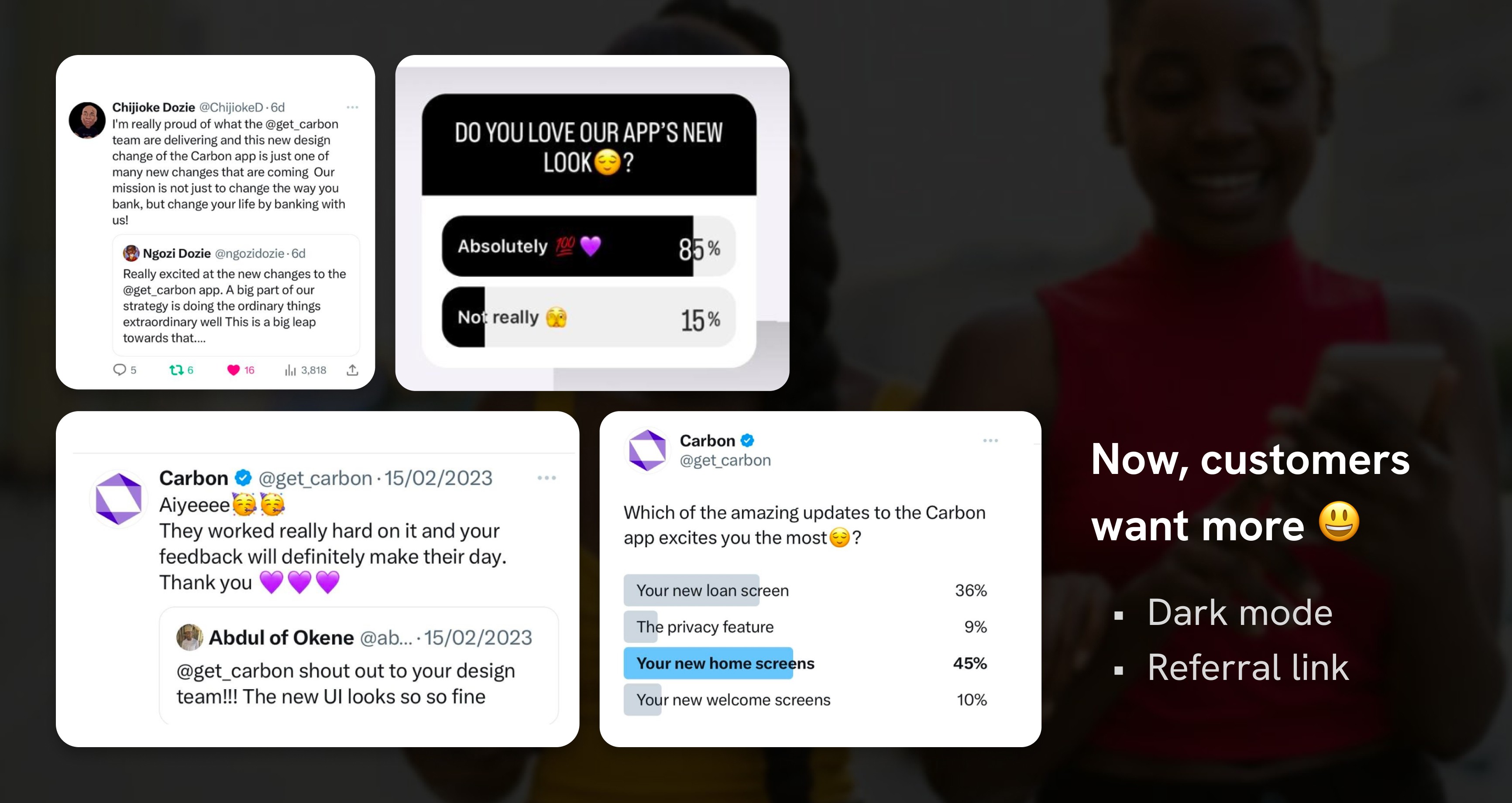
The combined impact of these enhancements was nothing short of impressive. Customer satisfaction with the product soared by a remarkable 81%. This boost had a cascading effect, driving organic referrals and resulting in a 25% increase in user registrations. Furthermore, it reactivated 10% of dormant accounts during the release month.
81%
surge in customer satisfaction
25%
Increase in user registrations
10%
reactivation of dormant accounts


BEHIND THE SCENES BELOW
Discovery
Insight into the problem, researching customers and understanding their needs.
Activities
Competitive analysis
Literature review
User interview
Key findings
Support tickets and store reviews reveal concerns and queries from customers whether Carbon has two types of applications. Further investigation revealed the cause to be disparity in the interfaces for both Android and iOS.
Based on the Nigerian Financial Services Market survey carried out by Intelpoint, security and safety of funds are factors people consider when choosing a banking/financial institution.
Define
Narrowing the focus, crystallizing the problem
Activities
Information architecture
Focus area
Implementation of a new design system to harmonize both visual and engineering efforts.
Improvement on the hierarchy of consuming content on the home screen to put focus on user needs.
Security feature in hiding balances to protect customer from prying eyes.
Develop
Working on potential solutions


Deliver
Finalizing the solutions that work and developer handoff


“ I'm really proud of what the @get_carbon team are delivering and this new design change of the Carbon app is just one of the many new changes that are coming. Our mission is not just to change the way you bank, but change your life by banking with us! ”

Chijioke Dozie
CEO | Carbon
Simplicity in design: Hear what a sample of your customers think before a public release. It's important to engage directly with users early on. Their feedback helps refine the product before it reaches the broader audience, ensuring that the design is both functional and user-friendly.
Building customer trust is a hack to growth: A significant growth lever is enhancing customer trust. By creating a reliable and secure user experience, it became easier for our customers to recommend to others, naturally expanding our user base.
The impact of a clean UI: There's a tangible benefit to designing a sleek, clutter-free interface—what's known as the aesthetic usability effect. This not only made the app more appealing but also reinforced trust, and trust brought growth.